When thinking about web design, you must consider the full spectrum of possibilities that the internet presents. Done boldly, designers can push the limits of human interaction and imagination on a global scale – as is often seen with edgier industries, such as creative agency websites.
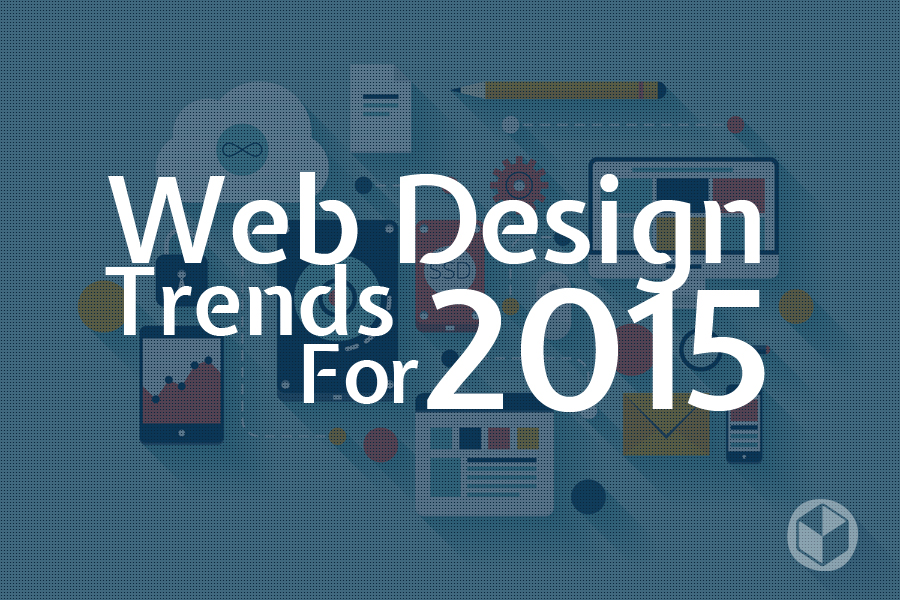
In this article, we’ll boil down some of the most prominent web design trends emerging in 2015. It is here that we can find true innovation and new opportunities – a few of which may completely change our understanding of a “modern website”.
1. Make it big

Website via Born
“Make it big” seems to be the single most important principle of web design today. Yet for many people, it’s hardly acceptable that the homepage – specifically above the fold – consists of just a few words overlaid on an image or a video. Sometimes, even the navigation is removed or (at the very least) is hidden as a small icon.
The two flavors of this web design trend can be labeled as “Cinematic” and “Book Cover”. The first has been inspired by movies and TV ads, while the second enhances the classic concept of printed book and catalogue covers.
The reasons for this trend are both visual and pragmatic. You’re able to give users maximum impact as soon as they land on your site and it’s easier to code, so it works well on mobiles and desktop computer monitors (the same layout remains unchanged despite the display device size).
Full screen images came into vogue last year (as we noted in our 2014 web design trends article), but with growing access to high quality images and speedier technology we’re seeing websites take these “Book Cover” layouts to the next level.

Inspired by movies and TV. Website via bellroy.
The “Cinematic” trend relies on fullscreen (or almost fullscreen) video with a few words and/or elements overlaid on top of it. We initially referenced this style in our article,”Web design trends for 2013,” when it was seen on a few agency websites.
Now the trend is picking up fast. Only last year Paypal updated its homepage with a fullscreen video background – a landmark move that has helped bring this concept into the mainstream.
2. The multimedia experience

Jack Daniel’s offers an impressive example of the modern “multimedia experience”
The multimedia concept is quite dated. The word itself has been so used and abused that it’s nearly lost its meaning. Nonetheless, armies of designers and programmers are constantly fighting to create increasingly engaging multimedia experiences.
A while back, Flash was the platform for these experiments. Presently it’s the HTML5 <canvas> element that will eventually allow you to create almost any visual effect on the website.

Website via The DNA project by j.viewz
Another noteworthy example of an interface built with HTML Canvas is community-driven DNA project by Brooklyn-based musician Jonathan Dagan (aka j.viewz). Opening with a highly visual background video, j.viewz tells us how he plans to build his new musical album through his personal experiments (which users can download) and other collaborators’ uploaded videos, music and feedback.

Website via Raise the River
Raise the River’s website is yet another fantastic example not only because of its apt visual metaphor, but also its presentation. The pace of animation and inability to scroll almost forces the user to take a breath and adjust to the page timeline.
While designing interfaces, we usually do everything to enable users. This website shows that disabling users for a certain amount of time may sometimes enable a better experience.
3. The Parallax effect mutations
Parallax has evolved into many different mutations that have one thing in common: designers use page scrolling or mouse movement to animate elements or properties of the page. If you look carefully, most of the websites showcased in this article use this logic. Here are some additional examples.
Scroll events and hand drawn animation

Website via Mint Design Company.
It’s easy to appreciate Mint Design Company’s creative use of an old CSS sprite technique. The result is an engaging and unique take on an otherwise straightforward company website.
Innovative scrolling

Website via QUO+
The QUO+ headset page takes you on a wild, maze-like journey through their site with vertical and horizontal scrolling – along with an interesting section where you “scroll” through their product colors too.
4. Animated storybook

Website via Boldking
In this type of page, similar to the first example, an animation sequence starts when a user reaches a certain scroll position. Often, it is just a few elements that slide into the page or use a fade-in effect to appear.
The Boldking product page (above) uses lightweight SVG and Java Script to present a visual metaphor describing the way their product works. Not only is the idea and animation amazing, but equally notable is the fact that it was achieved within 1.5 MB total page weight. Sometimes a single JS library has this size. One of the animated sequences is even interactive.

Website via Colin and Dewi
Colin and Dewi’s wedding website is a simple yet effective way to keep the user focused while reading a story. You are presented with one fragment of the story at a time. To see the next part, you need to scroll to it.
It sounds like generic scroll functionality, but 3D CSS animation – as well as hiding and revealing text fragments – makes the story much more engaging.
Header and page parallax effect caused by mouse movement

Website via HábitatWeb
This effect is used to create the illusion of a 3-dimensional space and works well when fit into the visual narration of the page, such as Habitat Web (above) or Archéologie de la Grande Guerre.
When used tastefully, this effect can have impressive result – although we predict that it will probably not become too common. If it were to be widely popular, it could just as easily be perceived as cheesy and annoying.
5. Flat design

Website via Colin and Dewi
During the last three years, flat design has been hailed the “king” many times over. It’s still doing great and is going to stay for good – especially in smaller elements such as icons, menus and illustrations.
Not only do these elements look good (way better than those glossy web 2.0 icons covering nearly every website a few years ago), but they are easily scaleable and manageable, thanks to icon font technology. icomoon.io is an example of one online service allowing everyone to create their own icon fonts easily for free.

Lab 21 turns flat design into “origami design”.
It is worth noting, though, that flat design is not always so flat. Designers often incorporate subtle gradients, textures and photos to achieve the “wow” effect. In our opinion, the best part of flat design is not the flatness of the ink, but how it opens us up to creative visual metaphors.
Rather than imitating objects with skeuomorphic techniques (where a notepad icon looks like real life notepad made of paper and bound in leather), flat design tries to convey the idea of a notepad through a synthetic, catchy and fun visual that works well in varied sizes.
We predict that this trend will become more collage-like and mix with other visual styles, similar to the HábitatWeb website featured earlier in this article.
6. No more boxes
Web designers always love to show they can think outside of the box – in more ways than one. One could call this trend “Draw a box and prove you can break it”. A rectangle screen is the frame for every web design (as far aw we know, we don’t have circular monitors yet). Every HTML element of the page is a rectangle too.
But designers, like most people, don’t like to be constrained. There are 3 distinct strategies to prove you are not a slave to the rectangle – and all 3 seem to be on the rise.
Create page layouts as though a rectangle never existed

Menu made of circles to navigate DAN’s Instagram photos. Website via DAN Paris.
Allowed are: circles, hexagons, irregular shapes even rhombuses.

Website via Lorenzo Bocchi
Skewed horizon and website layout previews in axonometric view on Lorenzo Bocchi bring the feeling of space and movement.

Website: The Rosa (via Pixelgrade)
While looking at the Rosa restaurant homepage your senses are deceived – you can almost feel the aroma of the cookies. Use a modern version of the centuries old Trompe-l’œil technique and imitate a real desktop inside a monitor. For example, take a wooden table background and then put all layout objects on it.

Website via Swiss airlines
The ultimate way of defying a rectangle is placing the user inside an infinite space where scrolling means flying, rather than, well… scrolling.
Swiss airlines challenge your understanding of website navigation. Browsing their page, you can feel how conventional our understanding of document space is. Here, instead of scrolling up or down, we dodge our way between the clouds.
7. Tiles

On the other hand, if you are comfortable with rectangles, a cool way to structure your content is by creating tiles. For some reason tiles in web design sell better than the Windows 8 Metro interface. Tiles work well in responsive layouts and, at the same time, remain a cool way of forming impressive layouts.
If sticking to tiles becomes too boring, the layout may be pushed further with irregular zigzag edges, pushing objects or bringing the text across the edges.
8. Navigation widgets

The Daily Beast navigation widget shows the scroll position within the article.
Experimenting with navigation has been web designers’ favorite playground for many years. “Playing” with navigation peaked when websites were designed purely in Flash. The decline of Flash brought us quieter menus, devoid of animation or eccentric interactivity.
But edgier navigations have been on the rise again, thanks in part to new web design potential and the growing inefficiency of existing navigation models in using across multiple devices. This is made easier thanks to the wide use of Java Script through Java’s constant evolution (via frameworks and plugins) and the more consistent interpretation of modern CSS across all important browsers.
Here are a few examples of navigation experiments and trends. Some of these ideas are already widely used, while others are pushing the envelope towards a new kind of “modern” web design.
Sticky menus

This type of menu expands a relevant item’s submenu as you scroll. It works well on one-pagers with lots of content. The LESS manual page is one of the most comfortable to use “manual type” webpages we have ever encountered. Website via Less CC.
A Sticky Menu is a kind of a menu that stays glued to the top or edge of the screen while you scroll. Like it or not, it’s becoming a standard for one-pagers.
Sometimes it’s combined with a scrollspy script to create a widget accurately showing your position on the page. It’s useful, especially with long hierarchical menus.
Sticky navigation attached to all 4 corners of the screen

Website via Hum
Street view type of navigation

Website via Oh Deer Games
Google maps, especially street view, inspired the author of Oh Deer Games to create navigation resembling a walk through Google street view. Time will tell whether this becomes a trend. For sure, this is not the only page exploring either Street View-style of navigation or the axonometric “fly over” views, better known in gaming.
Which brings us to another notable trend…
9. Integrating Google maps

We mark this as a trend not only because it’s been rising for some time now (and we see it almost everywhere), but also that it’s become more and more visually interesting thanks to the well-used customization options that Google provides.
The most interesting websites following this trend build their functional and visual idea around a map concept. And certainly they use customized Google maps adjusted to the page look and feel.
10. Mashup interfaces
Website via necotrans
The persisting love for one-pagers brings challenges that can be solved in creative, user friendly and visually attractive ways. The challenge is to fit a lot of information and functionality onto one page. The page has to have a clean modern look and be easy to navigate.
The solution may be something that we call a mashup interface: a layout consisting of many “layers” that adjust to the requested functionality or content. Actually it’s not a new concept at all – it’s the very nature of desktop applications – but it has not been very popular in the mainstream Internet so far. Recently, the use of such interfaces has been on the rise, and they are becoming more and more refined and functional.
Necotrans website seems to have little content above the fold, with a singular sentence overlaid on a full-screen photo. But the small, right side menu allows access to all essential functionality within the same screen area to offer users a site search widget (with results appearing as you type), customized Google map, news widget and contact form.
11. Minimize

Website via Maemo
The classic KISS principle (“Keep It Simple, Stupid” or “Keep It Short and Simple”) has been used in the military, business and government since the 1960s. Yet, even though you might work hard to simplify your designs, there is probably some room to push this process further still.
The Maemo restaurant tells its story with irresistible strength, using the simplest language possible, and then the visitor is confronted with a single call to action (“Book a table”), and the restaurant’s name over a background of cold fog swirling over the fjord.
Scrolling down brings a few photos in a casual layout, with horizontal and vertical alignments hard to find. The themes of the photos seem casual, too. Nonetheless, browsing this page offers an intense sensual experience. Ascetic form highlights the quality of the photos, while the minimalism makes you read the few sentences they cared to share carefully, like the words of wisdom.
What can be learned here? You can keep things visually quiet (quiet!) in web design and still achieve a great look! Try minimizing the content, form and color as much as possible while adding interest through big, realistic videos.
Conclusion
These web design trends have been creeping into popularity over the past year and are likely to heavily influence the way websites will be created in 2015. Nonetheless, if we were to summarize this year in one sentence, the most important thing to think about when designing a website would be “Content First”.
That mantra has always been true. But nowadays, an increasingly aesthetic emphasis on web design can reveal many of the mistakes made in the pre-design phases – concept, navigation flow planning, wire-framing, copy-writing, etc. As you broaden your horizons with new techniques, be sure that you don’t forget the basics.
Source: http://99designs.com/designer-blog/2015/01/16/top-web-design-trends-2015/


